


If I’ve seen it once, I’ve seen it 100 times – here’s how to goes:
Business owner knows they need to market their business. So they start doing allllll the things.
Posting on social media, sending emails, writing blog posts, showing up on every platform known to man, and churning out content like it’s nobody’s business.
I love that for them! I really do. But what I don’t love?
When they have no clear clue about which marketing efforts are generating real results for them.
So they’re stuck spinning their wheels doing something because they think they need to… when really they could potentially remove it from their marketing efforts altogether.
But how can you ever really know that? When you look at the data and clearly understand what’s working and what’s not.
The problem with that, however, is that most business owners think data = Google Analytics or something similar. And unfortunately, tools like that are often confusing and overwhelming, especially if you’re not a numbers person!
Heck, even if you are a numbers person, data reporting tools often give soooo much information it can be hard to know which numbers truly matter and which ones can be ignored.
So what’s a business owner to do?! The solution isn’t to just keep doing allll the things “just in case” they produce results for you.
The real solution is a custom analytics dashboard that can pull the numbers that matter, organize them for you in a way that makes sense for your brain, and give you a clear roadmap of what’s actually working in your business!
This is what my client, Carrie Melissa Jones, recently discovered and here’s how it went. 👇
About Carrie Melissa Jones
Before diving into Carrie’s custom analytics dashboard, it’s important to understand who she is and what she does!

Carrie Melissa Jones is a well-known community strategist who helps organizations design meaningful, sustainable communities.
Through her work, she educates and supports community professionals through content, training, and a paid online community.
Her marketing ecosystem includes a mix of:
- Blog content
- Email marketing
- YouTube
- Lead magnets
- SEO
- A paid online community
- Membership sales pages and funnels
In other words, there’s a LOT of moving pieces!
And maybe you can relate to that. You’re doing allll of the marketing activities that you know you should (or at least you think you should) be doing, but the question remains – is all of this work producing actual results?
That’s the question that Carrie wanted to answer and her custom analytics dashboard delivered just that!
What is a Custom Analytics Dashboard?
To fully understand this project, it’s important that you first understand what a custom analytics dashboard even is!
A custom analytics dashboard is a centralized reporting system designed around how a specific business operates.
So instead of looking at analytics platform by platform, the dashboard brings key data together so you can see the relationships between:
- Traffic
- Content performance
- SEO visibility
- Lead generation
- Community engagement
- Purchases and revenue
For Carrie’s project, the dashboard combined multiple data sources, including:
- Google Analytics
- Google Search Console
- Stripe
- ConvertKit
- Circle community analytics
- Google Tag Manager tracking
- Automated spreadsheets powered by Zapier
The result is a system that connects traffic → actions → leads → purchases → community engagement in one place.
Rather than focusing solely on vanity metrics, a custom analytics dashboard prioritizes the numbers that matter to YOUR business specifically so you can make data-driven marketing decisions.
Carrie Melissa Jones Custom Analytics Dashboard Project Overview
Before deciding to invest in a custom analytics dashboard, it’s important to recognize that Carrie already had lots of marketing data across multiple platforms.
She was actively using:
- Google Analytics
- Google Search Console
- Stripe
- ConvertKit
- Circle (her community platform)
Each tool contained useful information and it did give her certain data points, but none of them told the whole story.
Carrie wanted to answer questions like:
- Which marketing efforts are actually driving leads?
- Which content channels convert to paid community members?
- What blog posts or YouTube videos lead to purchases?
- Where are new members coming from?
- What parts of the community do members actually use?
- What happened yesterday in the business?
When asked why it finally felt the right time to start measuring her marketing in a new way, she said:
💬 I’m investing in way too many areas of marketing with my time, and I want to get more focused and targeted.”
Because of that, the main goal of this project was to create a single reporting hub that connects marketing activity, community engagement, and revenue.
Carrie’s Reality Before Using a Custom Analytics Dashboard
Before the dashboard build, marketing metrics were technically available to Carrie, but they weren’t easy to interpret.
Like mentioned above, important insights were scattered across platforms, which meant she had to jump between tools to track revenue alongside her marketing efforts.
Ultimately, this made understanding which content actually influenced purchases extremely difficult.
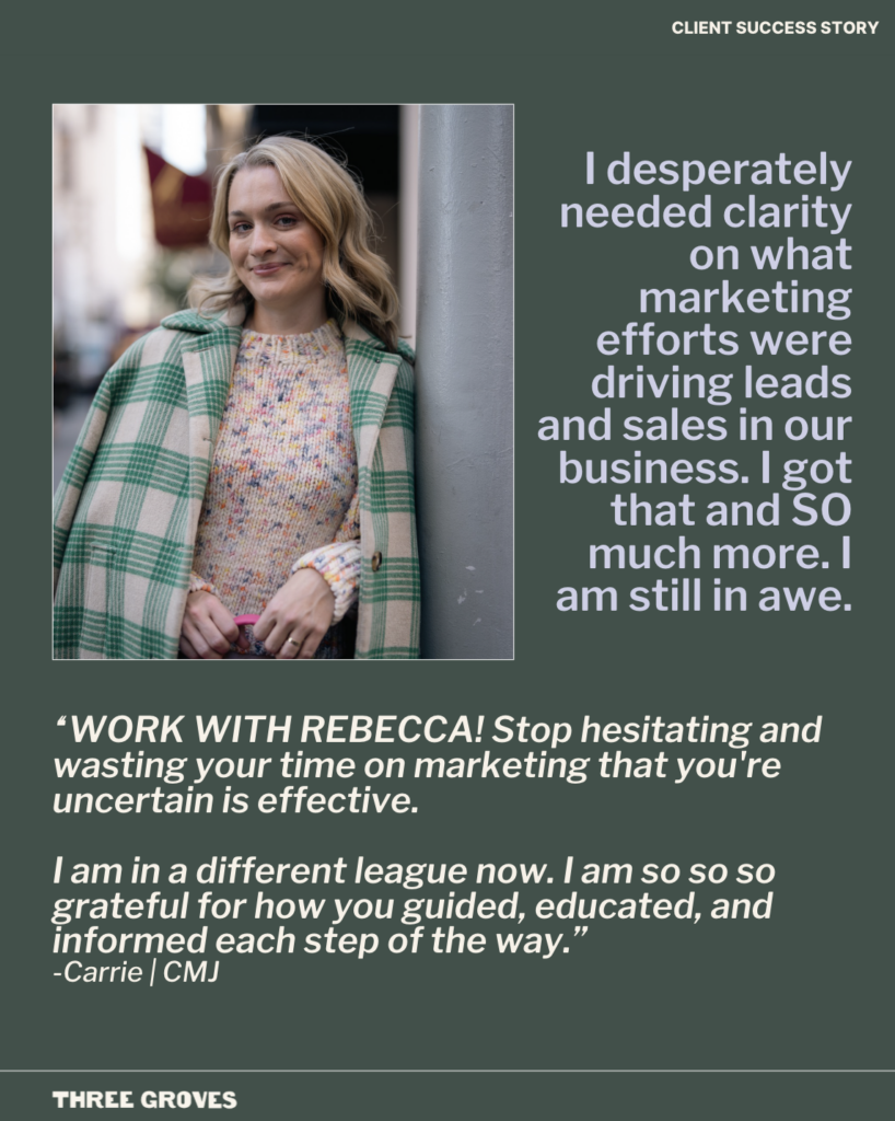
💬 Carrie summed it up best when she said, “I desperately needed clarity on what marketing efforts were driving leads and sales in our business.”
She wanted to:
✔️ Calculate cost per acquisition for paid community members
✔️ Identify which marketing channels generated the most leads
✔️ Invest more time in the strategies that were actually working
But without a centralized system, answering those questions took far too much time and often required guesswork.
The Process of Building a Custom Analytics Dashboard
My favorite part of building custom analytic dashboards for my clients is that they really are CUSTOM!
While you can absolutely follow a template to get better reporting, custom dashboards allow you to get to the bottom of what you’re really wanting to know.
It goes beyond the surface level data and answers SPECIFIC questions that you have!
And for Carrie, a lot of those questions were based around which marketing efforts were actually driving leads and paid community members, what content was converting into sales, and how people were engaging inside her community after joining.
To answer those questions and give her the ultimate clarity that she was looking for, her dashboard was designed as a multi-page reporting hub that brings together marketing, community, and revenue data.
Each section of the dashboard addresses a different area that she was hoping to solve!
Here’s a quick recap of what I put into place:
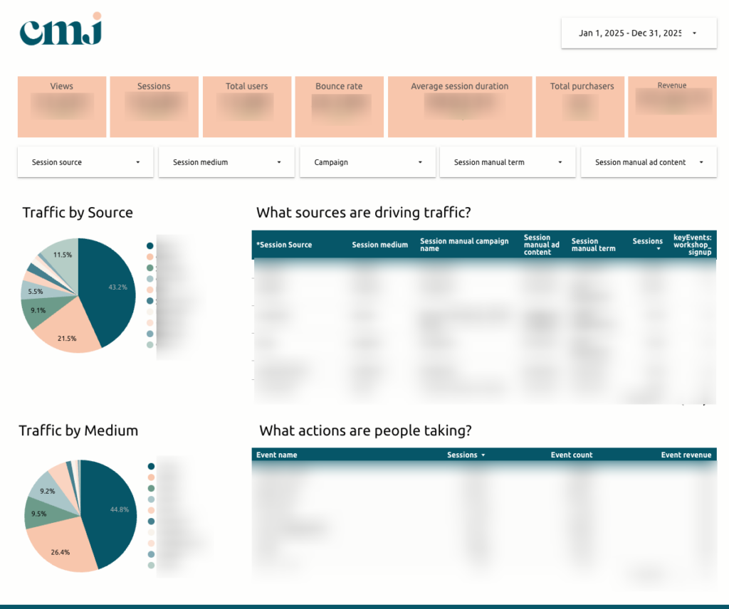
Website Performance Overview
The foundation of the dashboard is a website performance layer that tracks:
- Users and sessions
- Bounce rate
- Average session duration
- Traffic by source and medium
- Key events and actions taken on the site
This is that “basic” data that every dashboard should include – whether you’re DIYing yours or investing in a custom build.
You want to be able to see how many people are visiting your site, how long they’re staying, and what they’re doing once they’re there.
For Carrie, revenue and purchaser data are also incorporated into this view, allowing traffic and sales to be analyzed together.
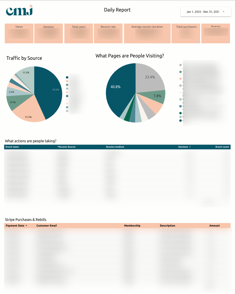
The Daily Report: What Happened Yesterday?
One of the most valuable features of this dashboard is the Daily Report.
This page (which is also delivered as a daily email to the client!) answers a simple but powerful question: what happened in the business yesterday?
It includes:
- Traffic metrics (users, sessions, pageviews)
- Bounce rate and engagement
- Purchases and revenue collected
- Top traffic sources
- Most visited pages
- Key events and actions
Instead of digging through multiple analytics tools, Carrie can open her daily report email and immediately see the previous day’s performance.
And if you’re wondering if this is really necessary… don’t just take it from me!
💬 Carrie said:
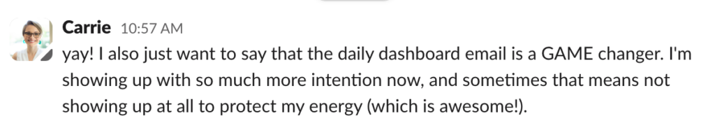
Did you catch that? Not only is she showing up with more INTENTION (because she knows what efforts are producing real results), but sometimes she’s choosing not to show up at all to protect her energy.
That’s the real business owner dream isn’t it?! To be able to intentionally make the decision NOT to do something?
I love to hear it! Because yes, in case no one’s ever told you this before, you’re allowed to STOP doing something that’s not serving your business.
Content Performance
Content plays a major role in Carrie’s marketing strategy and a huge focus was helping her understand which content was performing best so she could do more of the same and have more clarity on what types of content to create next.
For Carrie’s dashboard specifically, I separated her blog reporting from the rest of the site using the /blog/ URL structure, allowing for clearer insights into:
- Most visited pages
- Most visited blog posts
- Average time spent on content
This makes it easier to identify which content attracts readers and which posts deserve updates or additional promotion.
SEO Performance and Page-Level Deep Dives
SEO reporting combines data from Google Analytics and Google Search Console to track:
- Keyword impressions
- Clicks
- Click-through rate
- Average search position
- Visibility trends over time
A deep-dive page allows Carrie to select a specific page and view:
- Traffic sources
- Engagement metrics
- Keywords associated with that page
- Revenue or actions tied to the page
This helps determine which SEO efforts are producing results and where optimization opportunities exist.
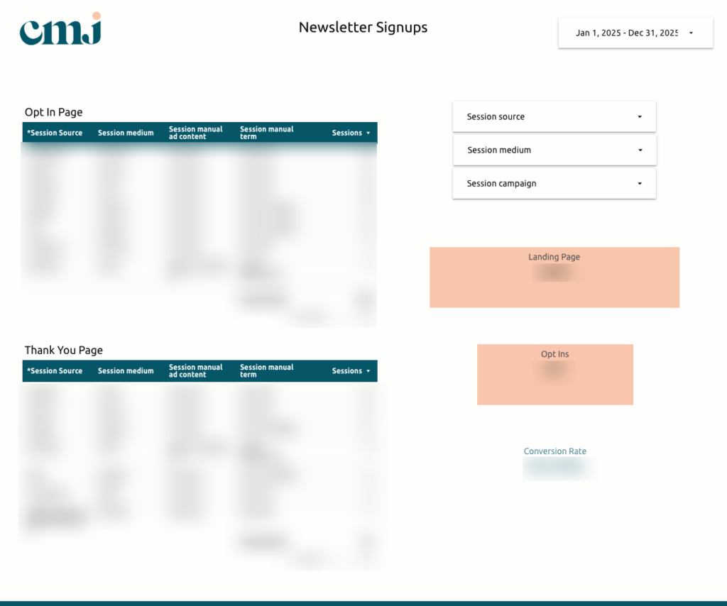
Email Leads and Funnel Conversion
Lead generation plays a critical role in growing Carrie’s community, so it was important that the dashboard included reporting that tracks:
- Email leads captured through ConvertKit
- UTM data for identifying lead sources
- Landing page → thank-you page conversions
- Opt-in funnel performance
This data helps Carrie connect specific marketing efforts to lead generation outcomes!
Community Engagement Insights
Carrie’s paid community runs on Circle, which means understanding how members interact with the space is essential.
This part of the dashboard tracks:
- Where members spend time within the community
- Engagement with onboarding and “Start Here” content
- Usage of announcements, directories, and deals sections
- Resource library engagement by category
- Workshop and event participation
- Messaging activity trends
These insights help identify what members value most and what may no longer be worth maintaining – aka what Carrie could do more or less of in terms of her membership!
Membership and Revenue Tracking
Speaking of her membership, Carrie’s dashboard has a specific section that tracks her membership revenue specifically.
This section tracks:
- Trials that convert to members
- Total revenue over time
- Refunds and failed payments
- Coupon usage
- Member counts and plan types (monthly, quarterly, annual)
- Churn and non-renewals
- Average membership duration
It also includes a workflow for connecting purchases to their original marketing source when additional attribution is needed!
The Result of Having a Custom Analytics Dashboard
After implementing her custom analytics dashboard, Carrie now has a single system that connects marketing activity to her business outcomes.
Carrie can now:
- Quickly see what happened in the business each day
- Identify which marketing channels generate leads and sales
- Understand which blog posts and YouTube videos drive conversions
- Track the health of her membership community
- Evaluate SEO progress over time
- Make strategic decisions about where to focus her marketing energy
In Carrie’s words:
💬 “Every day, I now see the sales for the day before, pageviews, and new leads coming into our funnel. I can see what blog posts are driving traffic, which YouTube videos are converting to sales, and which content is most helpful in our online community. Truly amazing.”
And perhaps the biggest shift, Carrie said, “I’m in a different league now.”
Simply from having allll of her business data in one place?! I have no words!
I always say data is powerful. But the thing is, Carrie did have the data – she just didn’t have it organized in a way that made sense to her or allowed her to actually use it powerfully.
So what I should really say is that data CAN BE powerful… when you can easily read it, understand it, and make decisions from it.
This one simple switch completely changed the way Carrie feels about and shows up for her business. And that’s possible for you too, friend!
Ready for Your Own Custom Analytics Dashboard?
If your business relies on multiple marketing channels – blogs, email, SEO, community platforms, or content marketing – but, like Carrie, you can’t clearly see what’s currently driving leads and sales, a custom analytics dashboard can truly change the way you run your business.
Instead of piecing together insights from different tools, you’ll have a centralized system designed around your marketing ecosystem that allows you to make faster decisions and better marketing investments!
If you’re ready to build a dashboard that turns your data into a decision-making system, you can CLICK HERE to learn more about my Custom Marketing Dashboard service!
At the end of the day, your marketing data isn’t helpful if it’s overwhelming. A custom marketing dashboard can take your data from something that’s just sitting there to something that’s readable and automated so that you actually ENJOY looking at it!
A Note From The Client
“WORK WITH REBECCA! Stop hesitating and wasting your time on marketing that you’re uncertain is effective.”
Communication Satisfaction: 5 Stars
Outcome Satisfaction: 5 Stars


